Logotype
Minimum logo size:
10 px or 3 mm of logo height.
10 px or 3 mm of logo height.
The basic element of the visual style is the logo, which should appear on all company materials. The typographic logo of BUDEX is based on the original modified Hrot Premium font with a generous spread. The "X" is the imaginary intersection of ideas and technological innovations that distinguish BUDEX.
Logo download
Choosing logo version
By downloading a specific version of the logo (Screen Version vs. Print Version) straight away to get the relevant color of the logo for your use. The table shows a summary and the most common cases.
| Features and use of the logo | Version for screen | Version for print |
|---|---|---|
| Color mode of downloaded files | RGB | CMYKPantone |
| Recommended logo formats | PNGSVGPDF | EPSPDF |
| Web and presentations (PowerPoint, Keynote) | ||
| Online documents (Google, Office365) | ||
| Business card, flyer or brochure | ||
| Contracts and documents for printing |
For a more detailed acquaintance with the possibilities of formats, applications and file manipulation use: logo format selection guide.
Protection zone:
100 % of logo height
It is a space around the logo, where no surrounding graphic elements (logos, texts, images, page margins, etc.) must interfere so as not to disturb the brand. In most cases, the logo is in the surrounding context of other elements, from which it distances itself and differs due to the space of the protection zone.
Protection zone
Things to avoid
The visual impression of the logo must be consistent. In order to achieve this, we follow these rules, which prohibit manipulation of the logo, especially in these ways.
Do not use shadows
Do not rotate logo
Do not recolor logo
Do not deform or change its original proportions of the logo
Do not outline logo
Logo on background
Logo: Version for light background
Background: White
Logo: Version for dark background
Background: Black
Logo: Version for light background
Background: 0 % – 30 % Black
Logo: Version for dark background
Background: 31 % – 100 % Black
Logo: Version for dark background
Background: 0 % – 30 % Black
Logo: Version for light background
Background: 31 % – 100 % Black
Lower intensity black and white photography allows for a black version of the logo.
Illustration at the location of the marker does not read many details, legibility of the logo is ensured.
Abstract photographs with higher contrast above 30% allows the white version to be placed logo.
Abstract photographs with higher contrast above 30% allows the white version to be placed logo.
The white version of the logo used on too complicated background preventing good legibility.
Black version of the logo used on too dark photo, part of it is illegible.
Dimensional range
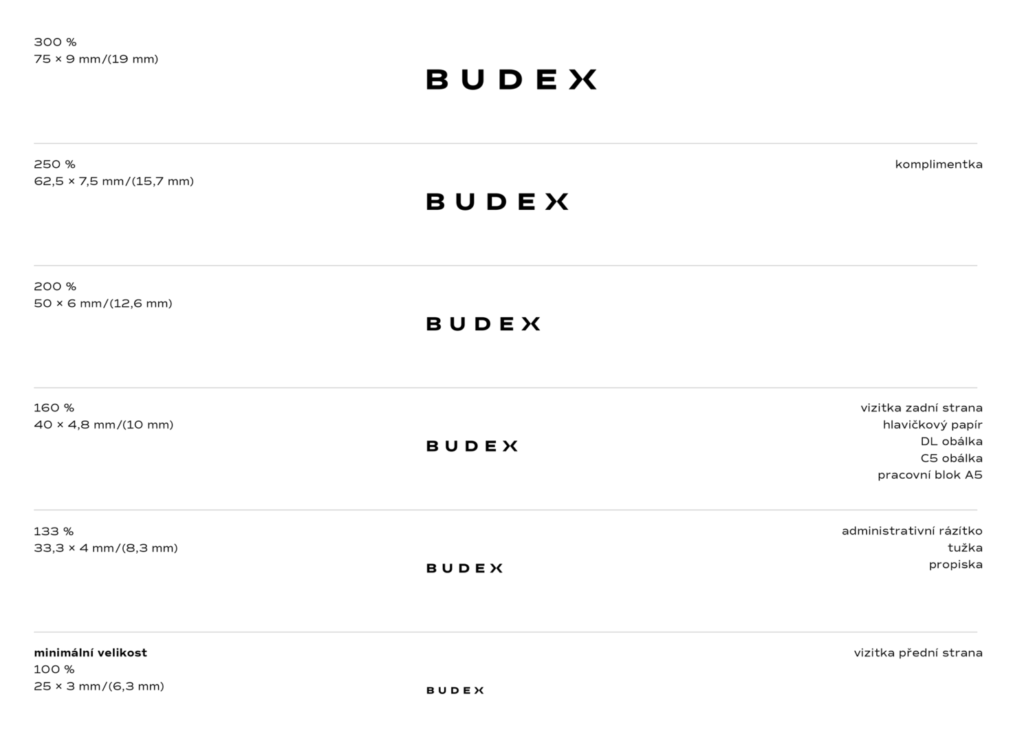
The dimensional range helps to ensure uniform use of the brand. It is a range of recommended brand sizes that should be used in specific applications.
The minimum size of the BUDEX mark corresponds to a text height of 3 mm and is 100%. This size guarantees the legibility of the mark.
A 133% mark size is used on the front of business cards, pens and pencils. The most commonly used 160% mark size is used on A4 size letterheads and forms, on the back of business cards, on DL and C5 envelopes and on the work pad. The 250% mark size is used on complimette.